The New Qualities for Customer Service Excellence

The covid pandemic clearly highlighted those companies that truly care about their customers and which provide customer service excellence.

If a company claims to be customer centric, they must not just talk the talk, but walk the talk too. The pandemic gave many people more time to review from whom they bought and what services they were getting in return.

A few years ago I was prompted to question my own purchase decision of cable services from the Swiss company UPC-Cablecom. It had been known to have a  long-term deficit in customer service excellence versus its main competitor Swisscom. And as recent PWC research shows, 86% of buyers are willing to pay more for a great customer experience.

Swisscom has made customer service their MSP (main selling point or value proposition) and they were renowned for putting their customers first. UPC-Cablecom, on the other hand, had until then, been trying to win customers through non-stop promotions and aggressive price cutting. In today’s connected world, especially where the internet is concerned, dissatisfied customers will be quickly heard – across the net.

Back to the incident that prompted this post. After a few days of being ignored by UPC-Cablecom – my perception at least, because my emails and phone calls were not being answered – I’m somewhat embarrassed to say that I resorted to Twitter.

More than five years ago, Twitter was first referred to as today’s customer service centre. Social media usually guarantees a quick response, since contacting customer services through the usual channels often results in no reaction for hours if not days.

What makes a great customer care centre?

Customers these days expect a response in minutes or hours rather than days. Research shows that nearly half of all customers (46%) expect companies to respond faster than 4 hours, and 12% expect a response within 15 minutes or less. And yet the average time to respond to customer service requests is currently 12 hours and 10 minutes! How do your own customer service response times compare? As you enjoy my blog posts I assume they are significantly better.

Most call centres are a frustrating, if sometimes necessary, experience for (often dissatisfied) customers to endure. In many cases, they are automated, with a long and complex self-selection process of button pushing to arrive at the department one needs – if you’re lucky that is!

But too often the result of all that effort is just a recording telling you to call back later as the department needed is not open at the moment, or that the collaborators are currently busy and to please stay on the line.

We are next subjected to music supposedly designed to calm our nerves, interspersed with messages suggesting alternative solutions to waiting in line. Go to the website to find a solution in their available FAQs, complete a contact form, or send an email. I find this insulting since I am sure most people only call after trying to find a solution … Click to continue reading

Packaging: Are You Using This Free Channel For Communicating With Your Customers?

Do you consider your packaging to be a part of the product, protecting its contents and framing its on-shelf life? Or do you consider it to be an integral part of your connection with your customers at an important moment of truth, that of purchase and usage? Or both of these?

If you answered both, then I believe that you are making maximum use of your packaging or at least you recognise its potential for communicating.

If you answered only one of the choices, then you may be missing an important opportunity. Let me explain, with a few examples.


People don’t read instructions

We all expect most things that we use or consume to be intuitive these days. In other words, we assume that we will understand how to build / cook / use them without reading the manual / instructions.

If you are like most people – myself included – this has nothing to do with the complexity of the product concerned. I myself will only turn to the instructions when something doesn’t work: I end up with left-over screws when mounting a flat-pack piece of furniture, or I can’t achieve multi-recordings on my smart TV or cable box.

In the article How Likely Are You to Read the Instructions they link behaviour to personality types. It makes an interesting read and offers at least some explanations as to why many (most?) of us still don’t read instructions.

Since the internet arrived, we have access to more and more information, and yet we seem to be reading less and less. Therefore as marketers, we need to ensure that any vital information we want to share, is clearly highlighted on the pack.


People do look at packs

Whether it is the cream we put on our faces, the cereal we eat for breakfast, or the dip that we offer to friends on match night, there are moments when we are faced with packaging for more than a split second. It is at these times that we are likely to read at least some of what is written on the pack.

It therefore makes sense to provide more than just a list of ingredients. After all you have your customer’s attention, so make use of it to impress or educate.

Here are a few of the best examples I have come across:

Nestlé does a great job of providing useful information on their pack,s with their “nutritional compass.” This includes four different pieces of information: good to know, good to remember, good question and the nutritional data.

What I particularly like about what Nestle has done, is to combine mandatory information on nutritional values, with useful information for the consumer. Although they may not be the most consumer centric company around, at least they did think consumer first in the development of their “compass.”

Juvena message on Packaging is Part of Product or PromotionJuvena of Switzerland: The short message to “Enjoy the smoothness” on the back of the Juvena hand cream sample tube, makes the experience both … Click to continue reading

The 6 Best Ways to Show you Respect Your Customers

I was recently asked to speak about how to build relationships with clients, in this case for a realtor association. In preparing for the interview, I got to thinking about customer privacy and how important it is to build a mutually beneficial relationship to respect customers.

Customers don’t want to be automatically segmented and followed as they go about the web, viewing different sites. An article on Business2Community by Owen Ray says that:

The tracking cookie is crumbling. Smart cookie-blocking technology led by Apple’s Intelligent Tracking Prevention (ITP) and Firefox’s Enhanced Tracking Protection (ETP) now block third-party cookies by default, and even Google’s Chrome will soon get controls that let consumers block cookies.”

If you want to understand more about the topic of cookies, I highly recommend this two-part article.

Companies that are truly customer centric know that it is important to build a mutually beneficial relationship where there is something for both parties in exchanging information and services. Many businesses ask far too much of their customers, with little if anything in return. I believe this is one of the major reasons customers today are becoming sensitive to what and to whom they give information about their interests, habits, needs and wishes. And why cookies are rapidly becoming a thing of the past.

I, therefore, thought it was useful to review the major points to keep in mind when a business wants to collect information about its customers in order to offer products and services that better meet their wants and desires.


1. Ask Permission to Gather Information

This should be a no-brainer and yet I still find myself on lists to which I didn’t intentionally, if at all, subscribe! You too?

Whether you are connecting with your customers by mail, phone, email or the web, you must first request permission to ask any questions and gather the information you are looking for.

Not only should you ask for their consent if you are not in direct personal contact, but you should also double-check that permission when connecting via email or the web. You have to ensure that the agreement has been given by your customers and that they are still ready to provide the information.

Being attentive to privacy when starting to build a relationship is vital and shows that you respect your customers.

This also means asking them to confirm their consent not once, but twice. Double opt-in, as it is known, ensures that your customer is correctly identified and that they have indeed agreed to provide or receive information or to be put on your mailing list.

Far too often, I see requests where permission is encouraged by using colourful buttons to click, or an implied criticism if you don’t, with phrases such as  “No, I have enough sales” or “No, I don’t want to save money”.


2. There Must be Mutual Benefit

When your customer has agreed to provide information, you need to thank them immediately. This can be as simple as … Click to continue reading

The Risks of Not Knowing All 12 Essential Elements of Your Target Customer

I think it’s pretty clear to everyone in business that NOT knowing your target customer costs a lot – sometimes the business itself! (Think Kodak, Nokia, Borders)

So let me ask you this; how well do you really know your own target customers? Are they men, women, younger, older, Fortune 100 companies, local businesses? If you can at least answer that, then you have the basics, but how much more should you know about them?

Well I can help you there, with these 12 essential elements of a customer persona or avatar. 


Background

I was recently working with a local service provider that was looking to improve their online presence. They were keen to have more impact on social media and had asked for advice about the best platforms, optimal frequency of publishing and possible content ideas.

They are a new client for me, so I think they were a little surprised when I didn’t get straight into the “sexy” topic of social media. Instead, I started by taking them through the basics of target customer identification. Lucky for them that I did!

When we had finished the exercise, we had actually found five different targets for them to address, rather than just the two they had been addressing until now. This clearly would have an impact on both where, what and how they communicated online.

It is for this reason that I always recommend that every brand and business completes a target persona and regularly updates it every time they learn something new about their customers. I also encourage you to keep it handy, ideally always visible on or around your desk. That way you will always be thinking customer first whenever you are working on a new project.

So let’s imagine that we’re having our first meeting together and I’m asking a few (well 12 actually!) questions about your customers. How many can you immediately answer?


The 12 Essential Elements of a Target Customer Persona

C3Centricity has designed a simple template that helps clients have all the essential information about their customers in one place, summarised on one page. It’s called the 4W™ Persona Template; if you haven’t already done so, you can download it, together with a detailed workbook explaining exactly how to complete it. Just click on the image below.

I would highly recommend you download it right now, before continuing to read, so that you can follow along with the one-pager in front of you.


Here are the 12 essential elements you need to have at hand in order to complete the template:

1. WHO – DEMOGRAPHICS: This is usually a “no-brainer” and is how most organisations describe their customers. However it’s not really original and definitely not competitive, although they are an essential foundation.

But there is so much more you should and absolutely must know about your customers, so read on.

2. WHAT THEY USE: Whether you are offering a product or providing a service, you … Click to continue reading

Five Brilliant Ideas to Boost your Insight Development

Insights are the pot of gold that many businesses dream of but rarely find. Why is that? Are you one of them? If so then I have some practical ideas on how you can get much, much better at insight development.


#1. Insights rarely come from a single market research study

Management often thinks that insight is “just another word for market research”. I remember one of my previous CEOs saying exactly that to me just before he addressed the whole market research and insight global team at our annual conference. I’m sure you can imagine what a panic I was in as he walked up to the mike!
Core Strength Training and Three of Its Benefits for Your Back – Canadian Chiropractic Association (CCA) – Association chiropratique canadienne single dumbbell chest press free download pdf owner’s manual for image imtl99000 home gym.
Insights are demanding to develop and are rarely, if ever, developed from a single piece of market research. Each market research project is designed to gather information in order to answer one or more questions. Whilst it may enable a business to make a more informed decision based upon the objectives, insight development is quite a different process.

Insight development involves integrating, analysing and synthesising all the data and information you have about a category or segment user. Then summarising it into knowledge and turning that knowledge into understanding. Only then are you ready to develop an insight.

All brands should have (at least) one insight on which its image, personality and Big Idea (for communications) are built. For example

  • AXE (Lynx in UK): (young) men want to attract as many beautiful and sexy women as possible. This is one of their newer ads, where the seduction is a little less in your face and more subtle – but still there.


  • Haribo Starmix: There’s a child inside every adult. This “Kid’s Voices” campaign has been running for years and manages to surprise and delight with each new episode. Which is your favourite? Please add a comment below.


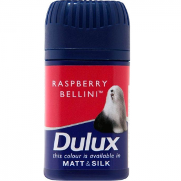
  • Dulux sample paint pots: I love to decorate my home, but I don’t want to look stupid by choosing the wrong colour. Although these are now a standard offer for many paint brands, Dulux were the first to understand the problem facing potential home decorators.

Dulux sample pot example of insight development

Insight development will provide the basis on which you will define the actions that are needed to change the attitudes and / or behaviour of your target audience. It also provides a solid framework on which to build your Big Idea for your communications’ strategy.


So there you have them, the five ideas and numerous examples that will help you to develop better insights more easily.

Although you probably already have your own process for creating them, I know from experience how hard it can be to find insights from all the information you gather.

I hope this short article has assisted you in your search for those “golden nuggets”. Do Click to continue reading

How to Improve Customer Centricity in Hospitality

The title of this week’s post might surprise you. After all, the hospitality industry should be highly customer centric, as it relies on satisfying its guests.

However, it can learn a lot from consumer packaged goods (FMCG/CPG), as I shared with industry experts at a Faculty Day of one of the leading hospitality schools in Switzerland. Having spent most of my career in consumer goods, I was invited to share what the hospitality industry could learn from the industry. From the reactions at the end of my talk it seems that the answer is a lot!

It might surprise you, but the two industries have a number of similarities. They both (should) have their customers at their heart. And they are both founded on pleasing and hopefully delighting their clients in the quality of the products and services they offer.

During my presentation, I shared many ideas; here are a few of the points I covered:


#1. From ROI / ROR to ROE

There has been a lot of discussion in the past few years about the need to move from a return on investment to a return on relationships. While I agree with the importance of relationships, I believe that what we should be talking about is engagement. Despite many books touting the need for our customers to “Love” our brands, in reality, I’m not sure that any of us want to have a deep relationship with brands.

The relationship is based on more than just the brand. It is founded on trust and confidence in the product, the brand’s website and their engaging communications. Think Coca Cola and Red Bull as great examples of this.


#2. Build Relationships with Strangers

The hospitality industry is based on serving and satisfying its guests. But in today’s connected world it also needs to consider people who are currently strangers – but could potentially become guests. These may include the friends of past guests, who have heard about the hotel or restaurant and are interested in visiting it for themselves.

One good example of this, but I know many hotels are also doing it, is the Rosewood Mayakoba resort in Mexico. This wonderful hotel encourages its guests to photograph their experiences during their stay at the resort and then to post them on Facebook.

This not only provides free publicity for the hotel, but also enables it to start engaging future guests before they even arrive. In addition, the posts will certainly have a positive influence on website visitors. And the guests who publish their photos, will have an even stronger positive impact on their friends and followers.  After all, they will more than likely have similar tastes and desires.


#3. Value is more Important than Price

Having additional control of our lives today, means that customers are re-evaluating what they are offered. They have higher expectations and are more discerning in their choices. They expect recognition at every touchpoint, even if in reality their decisions are influenced by … Click to continue reading

The 7 Essentials of Customer Centric Websites

I was recently reviewing corporate FMCG / CPG websites and what a shock I got! These are organisations with the consumer in their name, so they should be consumer-centric, right? Well yes of course!

However, very few of them seem to have taken the consumer’s perspective when creating their websites and even fewer delighted me sufficiently to make me want to return to their website, at least any time soon! 


From what I have seen so far, it appears that most organisations build their websites to share information with their customers. However it is the information THEY want to share, not the information their customers might want to have. So I thought about what would be important from a customer’s perspective. Here is my list, but please share your own ideas or additions:


The 7 things that MUST be on your website

  1. A clear structure that is intuitive – but still include a sitemap for those that need further help or are less logically minded
  2. Contact links or details on the home page, including telephone numbers, email, postal and street addresses and social media account links; it is why many of your customers will go to your website in the first place.
  3. A list of your products, br ands and services you offer, with details of ingredients, limits to usage, distribution or other details that might be of interest and relevance to your customers
  4. An About section showing the company details, including its management, geographical areas covered, mission statement, values, strategy and culture, as well as the latest news, both for investors  and customers
  5. Valuable content from the customers perspective, which is regularly updated and has cross-browser compatibility with web-friendly images. Since videos are one of the most popular elements researched on the web, it is a good idea to include them, as well as your latest TVC and print advertising – people love to watch and comment on them.
  6. FAQ section with most often asked questions, which should be constantly updated with new information as customers connect with queries
  7. Utilities such as search, sign-up, subscribe and RSS feed for them, tracking and statistical analysis for you


A good example for inspiration

One of the better ones I recently came across, and which is also a lot of fun to interact with, is the corporate site of Reckitt Benckiser. It really interested and engaged me for quite some time and in many different areas. For example, instead of the usual list of its br ands and their logos, it shows what it calls its Powerbr and line-up displayed on a retail shelf or in the rooms of a virtual home (I admit the supermarket bell irritated me somewhat but you can turn it off). You then click on the picture of the product to get more information on it, including its latest advertising. яндекс

This way of inviting interaction actually made me want to click on all the br ands to find out … Click to continue reading

Latest Post

[pt_view id=”999bb999ha”]

Join Global Customer First Strategists!

Get our latest posts before everyone else, and exclusive content just for you.

* indicates required

C3Centricity LogoJOIN C3CENTRICITY FANS

Get Useful Tips, Tricks & Tools Like These Sent Straight to Your Inbox

You have successfully subscribed to the newsletter

There was an error while trying to send your request. Please try again.

C3Centricity will use this information to send you useful updates and exciting marketing communications.