How do you think people recognise brands? And yours in particular? Is it by its logo, its colour, its pack, its jingle? Well, you may be surprised to learn these are all only pieces of the puzzle. A brand is a combination of elements, that together make it recognisable. But consistency and compatibility are often the two missing parts that are most often forgotten in building a brand.
Before I get started, I would like to suggest that you read a highly popular post on the topic of brand image here on C3Centricity, if you missed it before. It’s called “What Every Marketer Needs to Know about Brand Image, Equity, Personality & Archetypes” and will give you some great background information.
It covers the topic of brand image metrics in quite some depth, so is a great primer. But I feel that there is so much more to brand recognition that needs to be considered, than the elements that I mentioned in that post.
For example, more and more brands today additionally rely on a face, a voice, an aroma, a unique packaging style, a slogan or a sound that immediately identifies them. And when they do, their brand image gains in depth as well as emotional engagement.
In fact I believe that brands that lack connection with their customers are missing these powerful additions. They rely on mere basics to build their brand’s image, but they are no longer sufficient in today’s online -dare I say virtual? – world.
So here is my very personal perspective on some of the best examples in each of the additional areas I just mentioned. Feel free to add your own in the comments.
FACE
Progressive’s Flo and Dr Rick
Some of the faces which represent brands are of celebrities, while others are of unknown people who become celebrities thanks to the brand’s advertising.
One of the first faces I think of for a brand is Flo from Progressive. She won the hearts of Americans, ever since she was first introduced in 2008, with her helpful but quirky discussions with potential customers.
Flo made insurance less confusing and more friendly through her “girl next door” looks and sparky attitude.
In 2012, an animated box was added to their campaign concepts, to represent the company’s products in what was hoped to be a more fun and young-spirited way. Apparently, the vast number of ads with Flo – over 100 – had resulted in a “love her or hate her” relationship, but the box didn’t have the success of Flo.
Dr Rick claimed to help the younger adult target group Progressive wanted to attract by claiming to help them from becoming their parents. The “On call” campaign was born and appears to have succeeded where the animated box didn’t.
With the replacement of long-standing, award-winning CMO Jeff Charney by Remi Kent, former senior VP and global CMO of the consumer business group at 3M, we’ll have to see where Kent takes the brand going forward.
Nespresso
George Clooney has been the face of Nespresso for many, many years, in fact since 2006. He started off as a smooth and superior man-about-town; the type of man many women would love to be with and men would love to be. But over the years he has become far more approachable, even funny.
This new style means that the ads are always entertaining, even for non-Nespresso drinkers. In one of the latest, a Game of Thrones-inspired commercial featuring Nathalie Dormer, Clooney plays a knight who slays the dreaded dragon. When the medieval queen asks what he wants for saving the kingdom, he doesn’t reply but heads off to New York. “Tis all I desire,” he says as he returns to the palace with a cup of Nespresso in his hand. (See video below, thanks to Madame Figaro)
I wonder if like Progressive, Nestle is trying to open the appeal of its Nespresso brand to younger coffee drinkers through the use of more humour. Perhaps they are (also) hoping that the videos get shared on social media. Can we expect cats too in the future?!!
But humour is only one way to attract younger adults. Today they are very sensitive to such themes as eco-friendly, sustainability and recycling. For this reason, Nespresso also uses its advertising time to address these hot topics. Here is a recent example where they created a short series on being carbon neutral:
There are many other examples of “faces” that we now immediately recognise and associate with their brands. Even if some have been dropped over the years, they still maintain their strong connection:
SC Johnson’s Mr Clean and the muscle man
Quaker Oats and the Quaker.
Coca-Cola and the Polar Bear
Marlboro and the Cowboy – Darrell
Duracell / Energiser and the Pink Bunny
Each face is chosen to represent the brand because it fits with the values with which it wants to be linked. For example:
The Muscle man suggests toughness, never tired, perfect for house cleaning when you want the quickest and easiest solution to difficult jobs.
The Quaker implies integrity, harmony, simplicity, perfect for natural products.
The Polar Bear is associated with cold, stimulating, refreshing liquid (ocean), perfect for a carbonated soft drink.
The Cowboy suggests independence, freedom, strength, perfect for a masculine brand.
The Bunny implies endurance. never-ending energy, perfect for a long-lasting battery.
You will notice that more and more “faces” are now cartoon characters, rather than real people. The advantage of doing this is that associations are unlikely to change, unlike people. Just consider some of the recent sporting disasters which resulted in brands firing their “faces”.
Almost all celebrity spokespeople are required to sign an agreement containing certain moral or behavioural clauses. These give the brands the right to cancel a contract if the celebrity does something which could be damaging to the brand. Nike has done this with Maria Sharapova, Manny Pacquiao, Michael Vick and Lance Armstrong. Tiger Woods was apparently dropped by Gillette, Accenture, AT&T, Gatorade and Tag Heuer. Wow, that must have lowered his income somewhat!
Find out more about the challenges of choosing a face for a brand in this article on advertising law, and this one on the top 15 athletes who were dropped by their sponsors.
SOUND / VOICE / TONE OF VOICE
Besides the faces of celebrities, some brands have adopted a very individual voice or sound as well. This adds more personality to a brand and further helps it to stand out.
The sounds can be actual voices, such as the infamous Budweiser’s Wassup campaign that was first aired in 1999. (yes really that long ago!) Or the tones used in print advertising, which have become even more important with the rise of social media.
Both Coke and Pepsi use sound to great effect. For Coke, it is the ice being dropped into a glass and then fizzing Coke being poured over it. For Pepsi, although it may have started by using the sound of the ring pull releasing the fizzing bubbles from the can, the brand now introduces unknown music performers with their “sound drop” campaign.
Kellogg’s believed that the reason for their success was the sound their cornflakes made when they were being eaten. In fact, they hired a Danish sound lab to recreate the Kellogg’s crunch for inclusion in their advertising. It became so identifiable and uniquely Kellogg’s Cornflakes that the company went on to patent it.
Unilever’s Magnum is another brand with a distinctive sound. The ice cream is instantly recognised today from the cracking as the model bites into the chocolate coating. This sound is used at the beginning and at the end of the ads for their bars and more recently for their chocolate topped tubs too. Here is one of their recent ads showing the sound being used for both ice cream versions.
Moving on to the tone of voice on social media, some of the best examples I’ve come across include:
Innocent: Would you be interested in following a Twitter account that posted about natural fruit drinks all day? Probably not, and Innocent Drinks clearly understands that. Instead of simply advertising its juice products, Innocent posts chuckle-inducing, highly relatable content. Innocent comes across as being just a friend who is always coming out with random, yet spot-on observations of life. Who wouldn’t want to follow them on Twitter for this daily dose of fun?
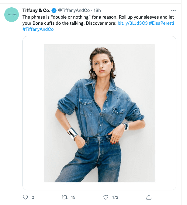
Tiffany: This heritage brand was recently acquired by LVMH and has shown remarkable growth following a daring change in its communications strategy. Its ‘Not Your Mother’s‘ campaign experienced significant backlash for offending its longtime customers, the older luxury customers. While it was certainly a risky move for Tiffany, they do say that the age group they are targeting is not as young as their critics believe it is.
Their tweets have always been more product related than in the past, but in line with their new positioning efforts, they include younger models wearing pieces in normal day-to-day situations. It relies far less than before on the elegant, cool sophistication of its physical presence in luxury surroundings and the use of its signature colour has also been stripped way back. I wonder if this will weaken or reposition its image in the longer-term? What do you think?
Old Spice: Having been successfully relaunched with its “Man your man could smell like” campaign, which was directed at females, it then moved to a more irreverent and fun tone which was designed to appeal to younger men. At least that’s what I think, but let me know what you think in the comments. I feel they lost their advantage over Axe (Lynx) during that time, so I’m glad to see that they are once again showing a real man’s man, but with a nice twist – even men need skin products. Here’s one of their latest ads, that personally reminds me of that earliest campaign.
AROMA
Smell is the only one of the five senses which connects with the right-hand side of the brain – did you know that? This is the area of the brain where creativity, emotion and hunger are processed, and memories of pleasurable experiences are stored there. Because of this, smell is the sense that can trigger an impulse reaction in someone.
As you know, branding is about creating an emotional connection with users and therefore aroma is a powerful ally in doing this. There is little logic involved in impulse purchases! We see it, we want it, we buy it. Aroma is being increasingly used these days to build brand attraction even further.
It is a powerful yet subtle way to gain customer loyalty, especially in such industries as retail, travel, hospitality, healthcare, finance or any business operating in a closed and controlled environments. You find yourself feeling good in certain places without really knowing why.
But aroma is so powerful, that some consumer products have been created or relaunched using it as their USP. Anyone remember the “green apple” scent that was all the rage back in the seventies?
Herbal Essences is a more modern example. It was originally launched as a single shampoo. But in the 1990s it was relaunched using commercials featuring women moaning with pleasure while using the fragrant product. The shampoos offered “a totally organic experience” thanks to their unique and luxurious perfumes.
Interestingly, and just like Nespresso, it too has joined the sustainable, eco-friendly and bio interests of recent years. Here is one of its more recent ads:
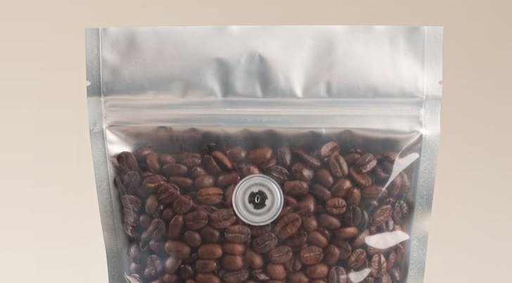
Coffee is an obvious choice for marketing on scent as a priority, even if taste is what will probably keep customers loyal. But in the past it was impossible for customers to test new brands before purchasing. The recent introduction therefore of the one-way degassing valves on coffee packaging, both grain and ground, is a welcome addition.
While scratch and sniff stamps have made a timid return on some personal and home care items, other brands have been launched in the past few years that are positioned almost exclusively on aroma, such as P&G’s Lenor Unstoppables™.
So you see the retail examples of the past are rapidly being joined by numerous consumer goods brands.
PACKAGING
Colour and shape are important elements of brand pack recognition. But packaging goes way beyond this today, as the above coffee example shows. A pack can become a brand’s signature, whether through its unique form, touch or sound. Yes, a pack can have a sound too – see the numerous examples below.
When thinking shape, Coke obviously springs to mind first, but Toblerone chocolate, Perrier water and Pringles chips also have distinctive packs. Their success can be witnessed by the copy-cat look-alike packs that have been launched by competitors ever since. In some cases even the pack’s colour is similar, making brand identification on-shelf more of a challenge. Go into any discounter outlet of Lidl and Aldi and you will be frequently confused by the brand they are actually offering.
Unique packaging forms have also become important in a number of industries as a way of combating market saturation or stagnation. These include cigarettes, candies, condiments and perfumes. In the later, product shape plays a vital role since the bottles are transparent and the majority are colourless too. Luxury can therefore only be suggested through the caps’ materials and by its form as well as that of its bottles.
Shape can also be used as a differentiator in providing additional benefits to the user. Think about the Heinz Ketchup squeeze bottle or the pump dispensers offered on products from cosmetics to liquid hand wash.
Companies are paying more attention to the sound their products’ packaging makes too. There is the well-known clunk of a luxury car door (not sure if we would call it a pack!), but also of the lid closing on a Pantene shampoo bottle. The click of a pen cap or mascara wand when closed are studied and evaluated so that they give just the right sound for associations with luxury or safety.